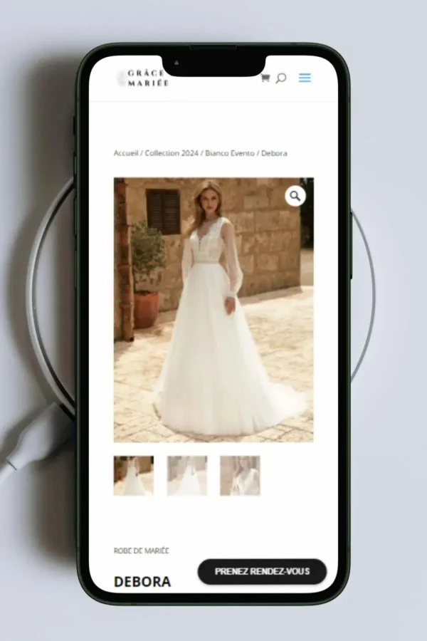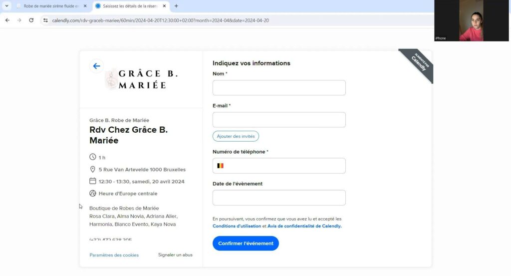
The aim was to check the website's user experience, and therefore to ensure that Internet users could meet the website's two objectives: to see the wedding dresses available in the boutique and to be able to make an appointment online to visit the boutique.
I was asked to do this by the manager of Grâce B. Mariée.
and scroll down to find out all about the project!
Check for cognitive bias using 3 user tests.
I've selected users from the subject: one who wants to get married, one who's getting married soon and one who's already married.
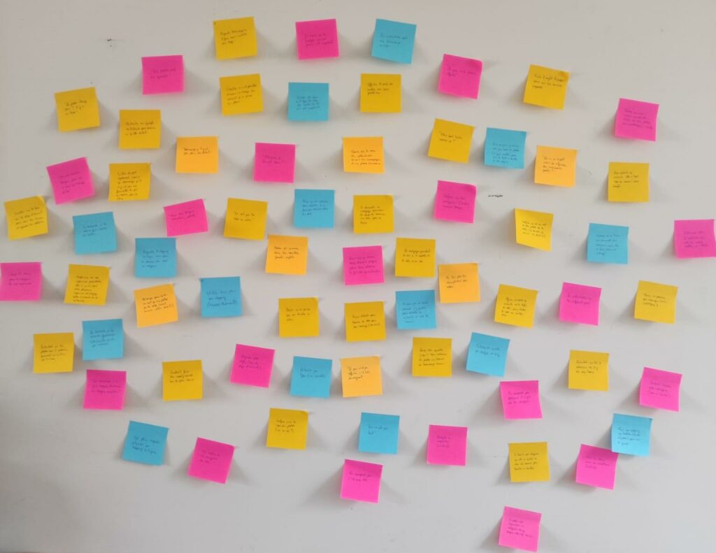
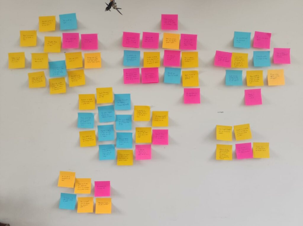
I then drew up an affinity diagram of the user journey to identify the pain points.


I was then able to draw up a customer journey map to clarify the user experience throughout their navigation of the website.
A few keys presented to the client to improve the user experience on her current website.
I really enjoyed carrying out this user experience analysis for this environment, which I knew absolutely nothing about.
Everything went like clockwork from start to finish and I can't wait to put my expertise back at the service of small businesses that want to put the user at the heart of their concerns!
J'utilise des cookies pour vous offrir la meilleure expérience sur mon site.