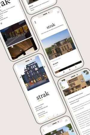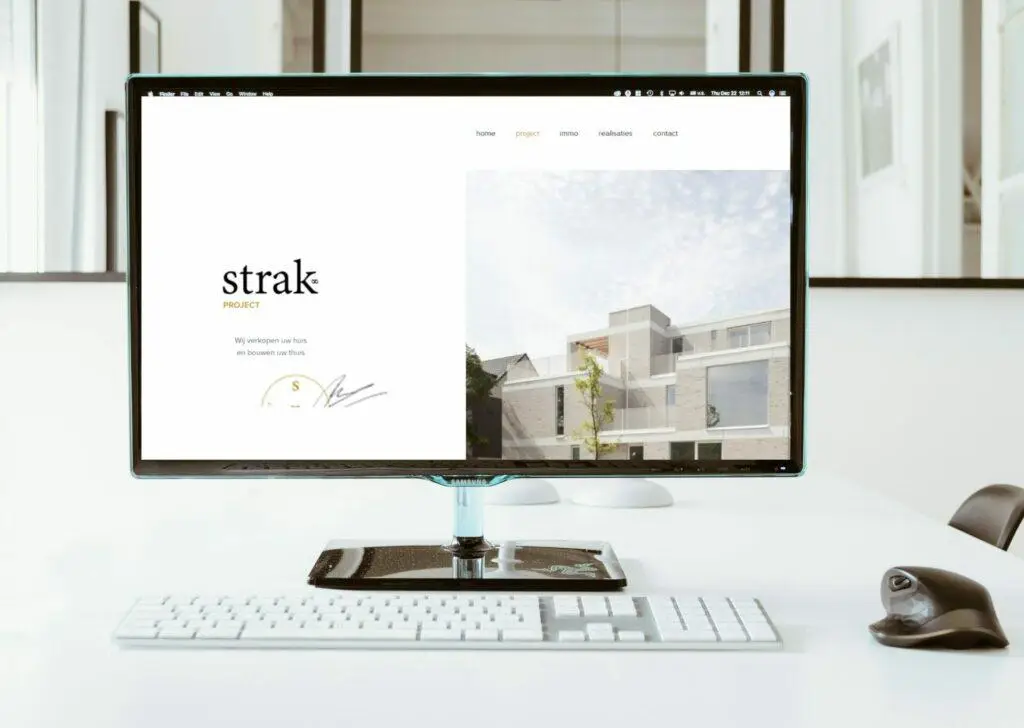
As the website had already been designed by a UI Designer, this involved translating the website into WordPress, using Elementor Pro. Creating all the screens in the CMS to make adding flats and buildings as easy as possible.
As the project was in Dutch, I was in charge of the website, but the communication and final texts were reviewed by our Dutch-speaking copywriter.
and scroll down to find out all about the project!
Discussions on the mock-ups received to check that all the screens can be envisaged with WordPress and Elementor Pro.
Thanks to their high-quality content, I was able to design the site in WordPress so that all the content could be integrated.
The entire website has been automated to make it easy for customers to add buildings, projects and flats.
My Dutch-speaking colleague took care of the website's SEO in terms of language. I made all the links with the analytical tools and minified everything.

As the mock-up had already been produced externally, my role was to translate it into a website. I enjoyed working with a prototype of the existing website and concentrating on reproducing it perfectly.
It was a challenge to reproduce the visuals exactly and to find dynamic solutions for integrating the functionalities into the design.
I also enjoy working on Dutch-speaking websites, although I recognise that my level of Dutch does not allow me to converse and brief a website like this.
J'utilise des cookies pour vous offrir la meilleure expérience sur mon site.